Datawrapper is a browser-based data visualization tool that lets anyone create interactive charts, maps, and tables without writing a single line of code. Founded in Berlin and built by a team with backgrounds at the New York Times, Bloomberg, and Deutsche Welle, it was originally designed for journalists who needed to publish data graphics fast and that focus on speed and quality has never left.
The workflow is intentionally simple: paste or upload your data, pick a chart type, customize the look, and publish. The result is an interactive, responsive visualization that can be embedded on any website, exported as a PNG, PDF, or SVG, or dropped straight into a PowerPoint slide. Every chart is accessible and mobile-ready by default, with no extra configuration required.
Deep dive
More about Datawrapper
Features
20+ chart types bar, line, area, scatter, pie, dot plot, range plot, waterfall, dual-axis, election results, and more
Three map types choropleth (country/region fill), symbol maps (point-based), and locator maps; built-in boundaries for countries, US states, and many more regions
Flexible tables searchable, sortable data tables with conditional formatting, color scales, and inline sparklines
Custom themes define your brand's fonts, colors, logo, and layout once; every chart your team creates inherits it automatically
Responsive by default every published visualization adapts to any screen width without extra setup
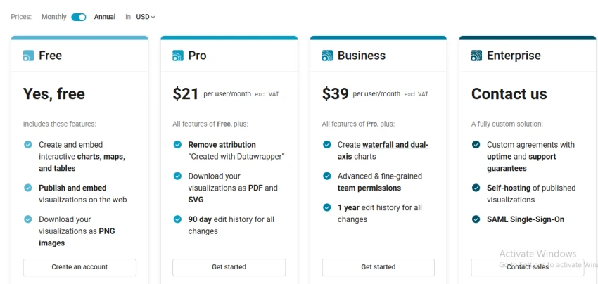
Multiple export formats embed via iframe, download as PNG (free), PDF and SVG (paid), or sync to PowerPoint
Real-time collaboration multiple teammates can edit the same chart simultaneously with live presence and inline comments
Pricing
What it's good for
Publishing charts in editorial content ideal for news articles, reports, and blog posts where the chart needs to embed cleanly and load fast
Quick turnaround visualizations going from a spreadsheet to a finished, embeddable chart in under five minutes is genuinely achievable
Teams without a dedicated data engineer the interface is approachable enough that non-technical users produce accurate, good-looking charts independently
Organizations with strict brand standards custom themes enforce brand consistency across every chart every person on the team makes
Geographic data choropleth and symbol maps are fast to produce and look polished without GIS knowledge
What it's not good for
Large or complex datasets Datawrapper is designed for relatively small, clean data tables; it is not a replacement for BI tools like Tableau or Power BI when you have millions of rows or need cross-dataset joins
Highly custom or non-standard chart types if you need a sankey diagram, a network graph, a treemap, or a bespoke layout, you will need a coding tool like D3.js instead
Full dashboard experiences Datawrapper produces individual charts that can be assembled on a page, but it has no native dashboard canvas or cross-chart filtering
Live database connections it does not connect directly to SQL databases, APIs, or streaming data sources; you work with manually uploaded or Google-Sheets-linked data
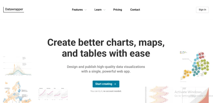
Homepage
The verdict
Pros & cons
Pros
Free plan is genuinely powerful unlimited charts, unlimited embeds, no time limit
Extremely fast to get started; no account needed just to try it
Output quality is consistently high charts look professional without manual tweaking
Accessibility and responsiveness handled automatically
Privacy-first by design no reader tracking on any plan
Cons
No native dashboard or multi-chart canvas
Limited chart variety exotic or highly custom types aren't available
No direct database or API connections; data must be uploaded manually or via Google Sheets
Not suitable for large datasets or complex data transformation
Editor is cloud-only no offline mode or desktop app
★ Verified reviews
Datawrapper reviews
No reviews yet — be the first to share your experience.
No reviews yet
Be the first to share an honest, verified review of Datawrapper.