I gave both tools the same job: paste a small table, make a chart, and leave with a file. One needed a text box. The other needed four steps and a sign-in form.
● ChartGPT
Paste Drop the table in a text box | Generate It picks the chart and the title | ✓ Download PNG, SVG, PDF or JSON |
No account at any point. The file is on your computer in three clicks.
● Datawrapper
Upload data Paste, file, Google Sheet or link | Check and describe Confirm columns and types | Visualize Twenty plus chart types, three tuning tabs | Publish and embed Sign in to download or embed |
Free to build. Creating an account is the price of taking the chart with you.
ChartGPT wins on speed Paste a table, get a chart, click PNG. Nobody asks for your email, and the tool chooses a sensible chart type for you. | Datawrapper wins on control More than twenty chart types plus tabs for refining, annotating and layout. The output looks like a newspaper graphic. The door closes at the publish step. |
Same numbers, same goal. I used a five row table of website traffic sources. The task in each tool was simple: get this table onto a chart and save it to my computer without creating an account.
| Traffic source | Percentage |
| Google Search | 40 |
| Social Media | 25 |
| Direct | 20 |
| Referral | 10 |
| 5 |
This is exactly what I pasted into ChartGPT, as a plain markdown table:
| Traffic Source | Percentage | |----------------|-----------:| | Google Search | 40 | | Social Media | 25 | | Direct | 20 | | Referral | 10 | | Email | 5 | |
One honest note before we start. In Datawrapper I used its built in example dataset, web browser market share, so I could move through the four steps quickly and show each screen. Pasting your own table follows the same path and hits the same wall at the end.
ChartGPT opens on a single text box. There is no upload screen, no wizard and no settings panel. You paste your data or type a sentence with the numbers in it, add a short note about what the chart is for, and press Generate[1].
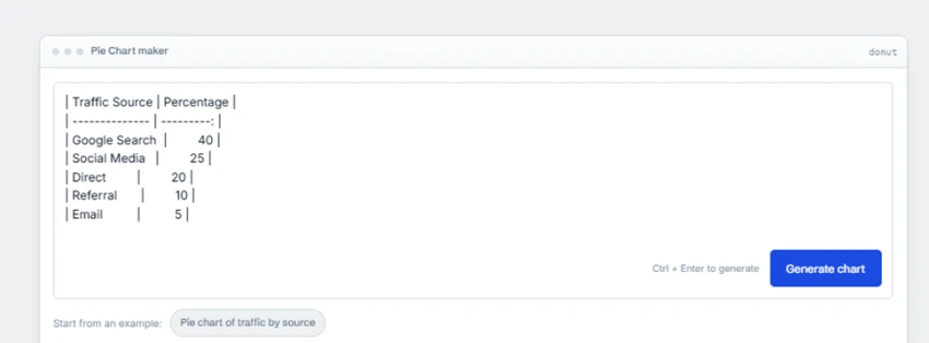
Step 1. Paste. The table went into the box as plain text. The example chip under the box, Pie chart of traffic by source, shows this is exactly the kind of input the tool expects.
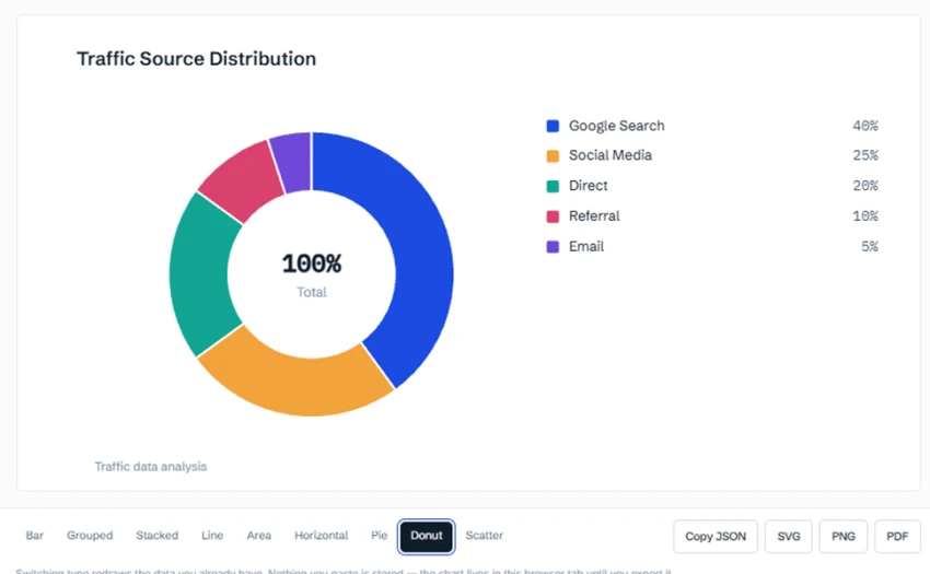
Step 2. Generate. ChartGPT read the two columns, chose a donut because the numbers are shares of a whole, and wrote the title Traffic Source Distribution on its own. Each source sits in the legend with its percentage. The strip below the chart switches between bar, grouped, stacked, line, area, horizontal, pie, donut and scatter, and switching does not cost you another chart from the monthly allowance.
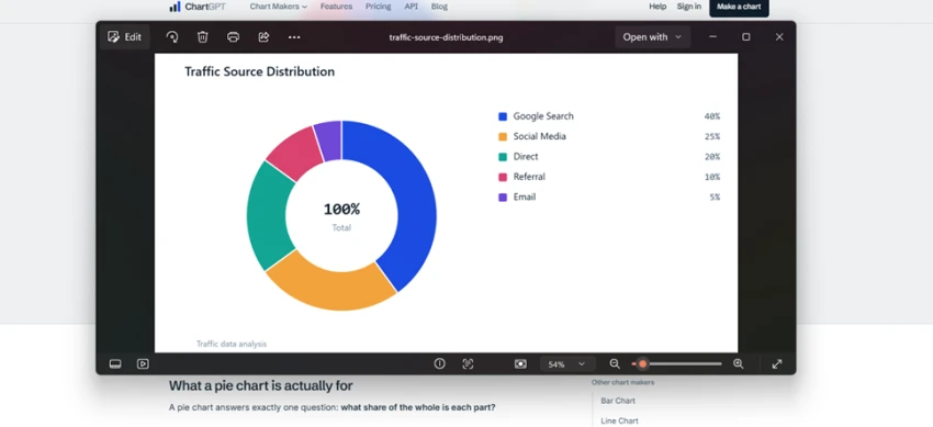
Step 3. Download. I clicked PNG. The file landed in my downloads folder and opened in my photo viewer. No account, no email, no watermark. SVG, PDF and a JSON copy of the chart spec sit on the same row of buttons.
Speed comes from having fewer decisions in the way, and that cuts both directions. The colour palette is fixed, so brand colours are out. Data goes in by paste only, up to 500 rows, so a CSV has to be opened and copied rather than dropped in. The free tier covers 15 charts a month. Nothing you paste is stored, so if you close the tab before exporting, the chart is gone.
Datawrapper is the tool behind a lot of the charts you see in major newspapers, and it feels like it. Instead of one text box you get a four step bar across the top of the screen. Each step is a full page with its own choices.[2]
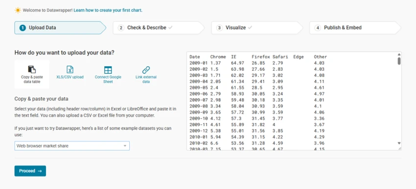
Step 1. Upload data. Four ways in: paste a table, upload an XLS or CSV file, connect a Google Sheet, or link external data. The last two matter if the chart needs to refresh when the source changes. I picked the example dataset and pressed Proceed.
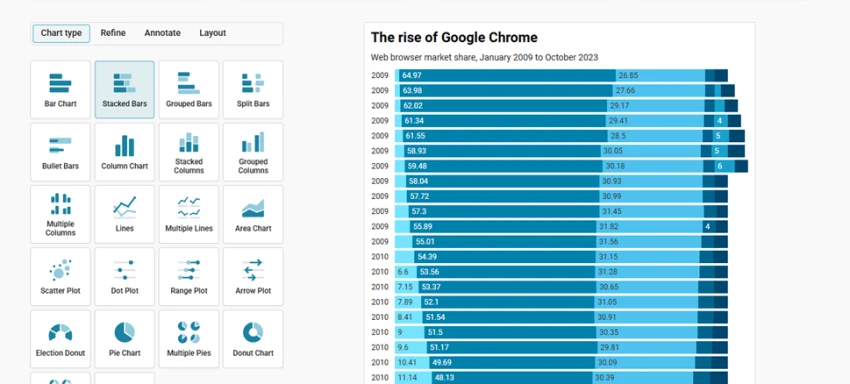
Step 2. Visualize. This is where Datawrapper pulls ahead. The chart type panel holds more than twenty options, from stacked bars and bullet bars to range plots, arrow plots and election donuts. Next to it sit three more tabs: Refine, Annotate and Layout. You choose the shape yourself, then you tune every part of it. The result already looks publishable with the default colours.
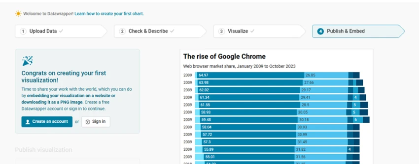
Step 3. Publish and embed. This is where my test ended. The panel congratulates you on your first visualization, explains that you can embed it on a website or download it as a PNG, and then asks you to create a free Datawrapper account or sign in to continue. The chart is finished on screen, but no file leaves the tool before that form.
To be fair to Datawrapper, the account is free and it unlocks the thing the tool is really built for: a live, embeddable chart that resizes on a phone and can update from a linked sheet. If your chart is going on a website, that is worth a form. If your chart is going into a slide deck this afternoon, it is one more wall between you and the file.
Speed and control are the headline, but the chart itself is what your reader sees. Put the two results next to each other and the difference in approach shows straight away.
The tool wrote its own title, Traffic Source Distribution, added a legend with the exact percentages, and placed 100% Total in the middle of the ring. The colours come from a fixed set, so every ChartGPT chart shares the same look. The chart is clear at a glance and would drop into a slide with no edits. The one weak spot is the subtitle, Traffic data analysis, which is generic enough that you would probably rewrite it in your slide or email.
Here the title and subtitle are yours to write, and the example came with a proper headline, The rise of Google Chrome, plus a subtitle naming the date range. Values are printed inside each bar so the reader does not need to look at an axis. The style is the same restrained look you see in newspaper graphics, and every part of it can be tuned in the Refine, Annotate and Layout tabs before you publish.
ChartGPT's chart is finished the moment it appears. Datawrapper's chart is finished when you say it is. Both look professional. One asks you to take part.
Read each row as one question. The shaded cell is the tool with the better answer to that question, not the better tool overall.
| ChartGPT | Datawrapper | |
| Sign in to get a file | Never. PNG, SVG, PDF and JSON download from the result screen. stronger here | Yes. Embedding or downloading the PNG asks for a free account at step four. |
| Steps from paste to file | Three: paste, generate, download. stronger here | Four pages, then the account form, then the download. |
| Who picks the chart type | The tool, from the shape of your data. You can switch between nine types afterwards. | You do, from a grid of more than twenty types including maps and tables. stronger here |
| Design control | Fixed palette. Adjustments are made by rewording your note, not by opening a panel. | Refine, Annotate and Layout tabs. Drag annotations onto the chart, change colours, set the layout. stronger here |
| Getting data in | Paste only, up to 500 rows. It also reads a plain sentence with numbers in it. | Paste, XLS or CSV upload, Google Sheet, or a link to external data that keeps the chart fresh. stronger here |
| What the chart is for | A file for a slide, an email or a one off report. stronger here | A live chart on a web page that resizes and can update itself. |
Both tools clear the first bar: you can open them and start building with no account. The choice comes down to where the chart is going next.
Pick ChartGPT when • The chart is for a slide, an email or a quick internal report. • You would rather the tool choose the chart type than choose it yourself. • You have a few dozen rows and about a minute. • You do not want to create one more account for a one off job. | Pick Datawrapper when • The chart goes on a website and needs to look right on a phone. • You need annotations, your own colours or a specific layout. • You want to link a Google Sheet so the chart updates by itself. • A free account is a fair trade for a chart that looks finished. |
| There is also a middle path. Draft in ChartGPT first to see which chart shape tells the story, then rebuild it in Datawrapper once it needs to be published. The first step takes a minute and saves you from tuning a chart type you were going to abandon anyway. |
ChartGPT and Datawrapper are not really fighting over the same chart.
ChartGPT is for the chart you need in the next five minutes. Paste, generate, download, done, and nobody asks who you are. It picks a sensible chart type for you, and the only real limits are a fixed palette and a paste-only input.
Datawrapper is for the chart that has to live somewhere. It gives you more shapes, more control and a more polished result, and it asks for a free account before it lets the chart out of the door.
If speed is the whole job, ChartGPT wins and it is not close. If the chart is going on a page people will read on their phones, sign up for Datawrapper and spend the extra minutes. Most people who make charts regularly will end up with both bookmarked, and the stopwatch test above is the quickest way to find out which one you will open first.
Related guides and breakdowns from the same category.


Join the conversation
No comments yet
Start the conversation on ChartGPT vs Datawrapper: AI Speed or More Design C....